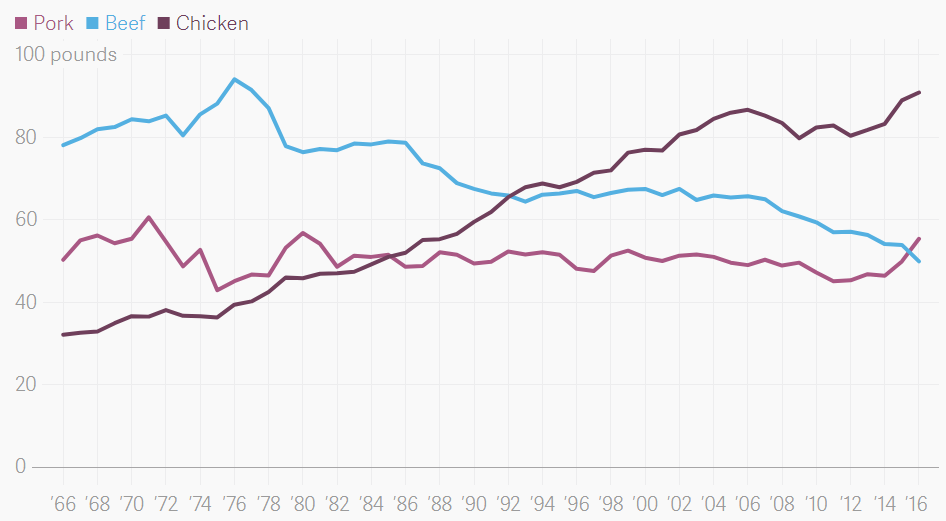
This week’s #MakeoverMonday challenge is about the yearly pounds per capita consumption of various meat products. The original chart is a line graph showing pork, beef and chicken consumption by year.
Initial Thoughts
- Labeling every two years is busy, 5 or less would be better
- The colors for Pork and Chicken are similar, while the blue used for Beef stands out. If unintentional, the colors should be adjusted.
- I really love the ‘100 pounds’ label at the top of the Y-Axis. It shows the units very clearly, yet unobtrusively, without requiring headers
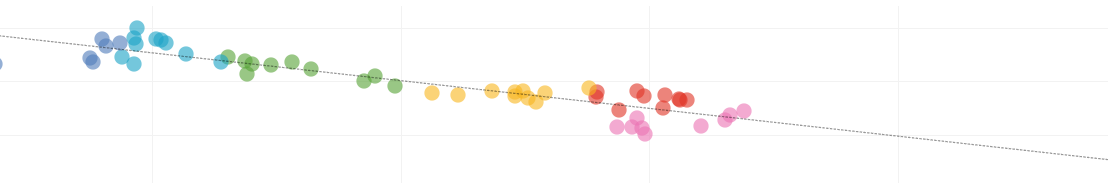
My Makeover
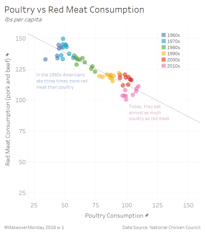
How it’s done
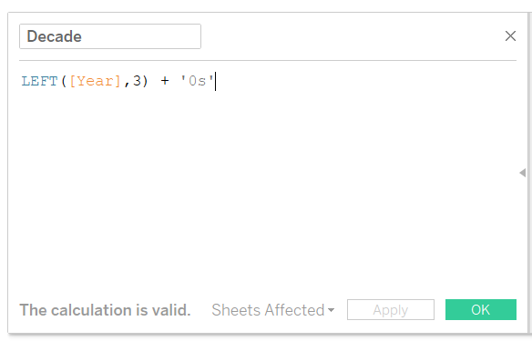
Step 1 – Create ‘Decades’
Step 2 – Build the View
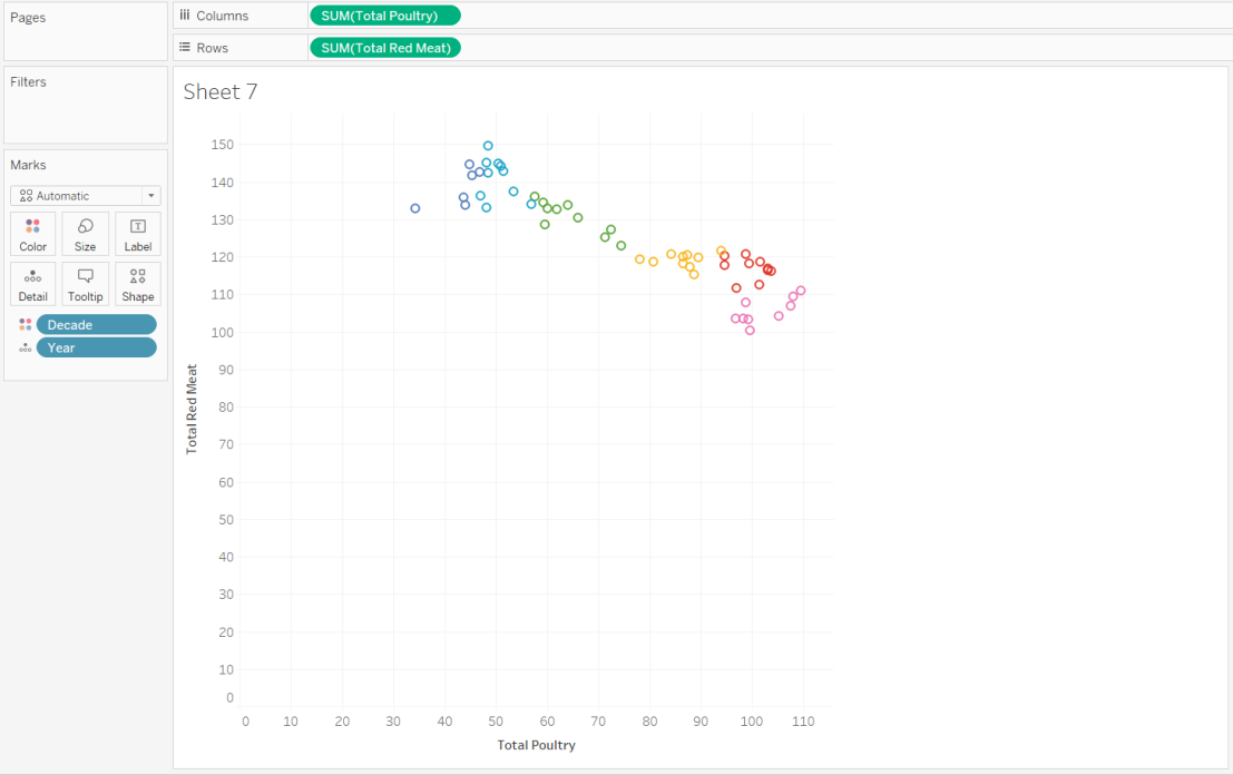
Step 3 – Add a Trend Line
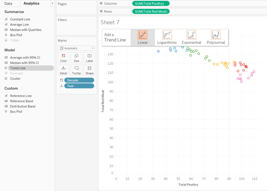
- After adding the trendline, edit it and uncheck ‘Decades’
Step 4 – Adjust Axies
- Make sure to apply these settings to both axies!
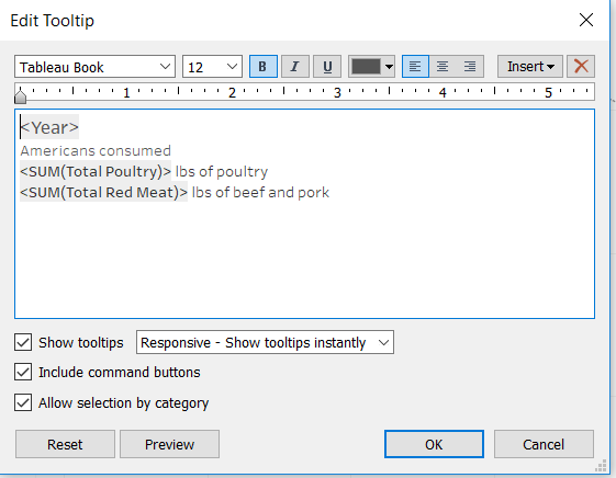
Step 5 – Tooltips
From here, it’s formatting and dashboard layout!

I especially like the concept of the plotting the orbit over time, year by year, but it is hard to distinguish which was the first and last point in the (sub)series. Could you pull off shading within your bins, with the last year of the decade being bright fully saturated with preceding years “fading out”?
LikeLike
I wound up adding a path/line going from year to year. Here’s a link to the updated version:
https://public.tableau.com/profile/g.hopper#!/vizhome/PoultryConsumption-V3/PoultryvsRedMeatConsumption
LikeLike